The FairTicks Chart — Complete Guide
Everything you see on the chart, explained simply. Whether you have never read a candle before or you have traded for years, this guide explains each label, every button, every risk line, and the one rule that matters most at FairTicks: protect the account first.
The chart is not here to make trading feel like a game. It is here to help you understand price, control exposure, see risk distance, and avoid decisions that can damage the account.
See the FairTicks Chart in practice
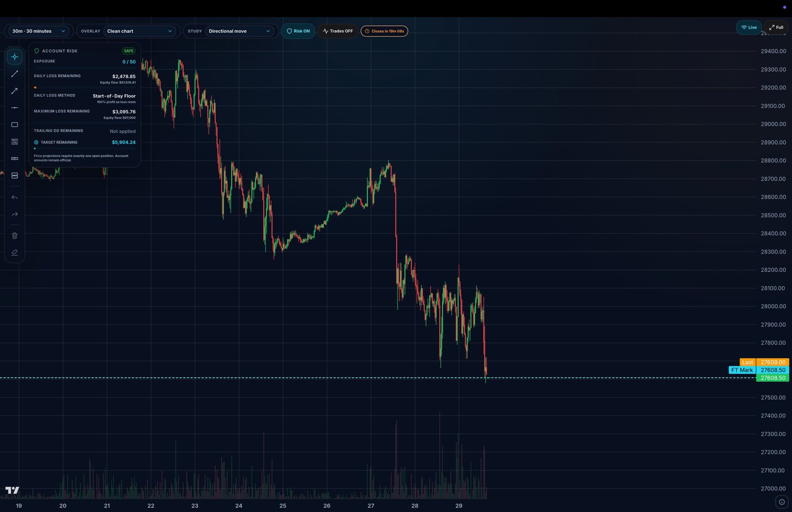
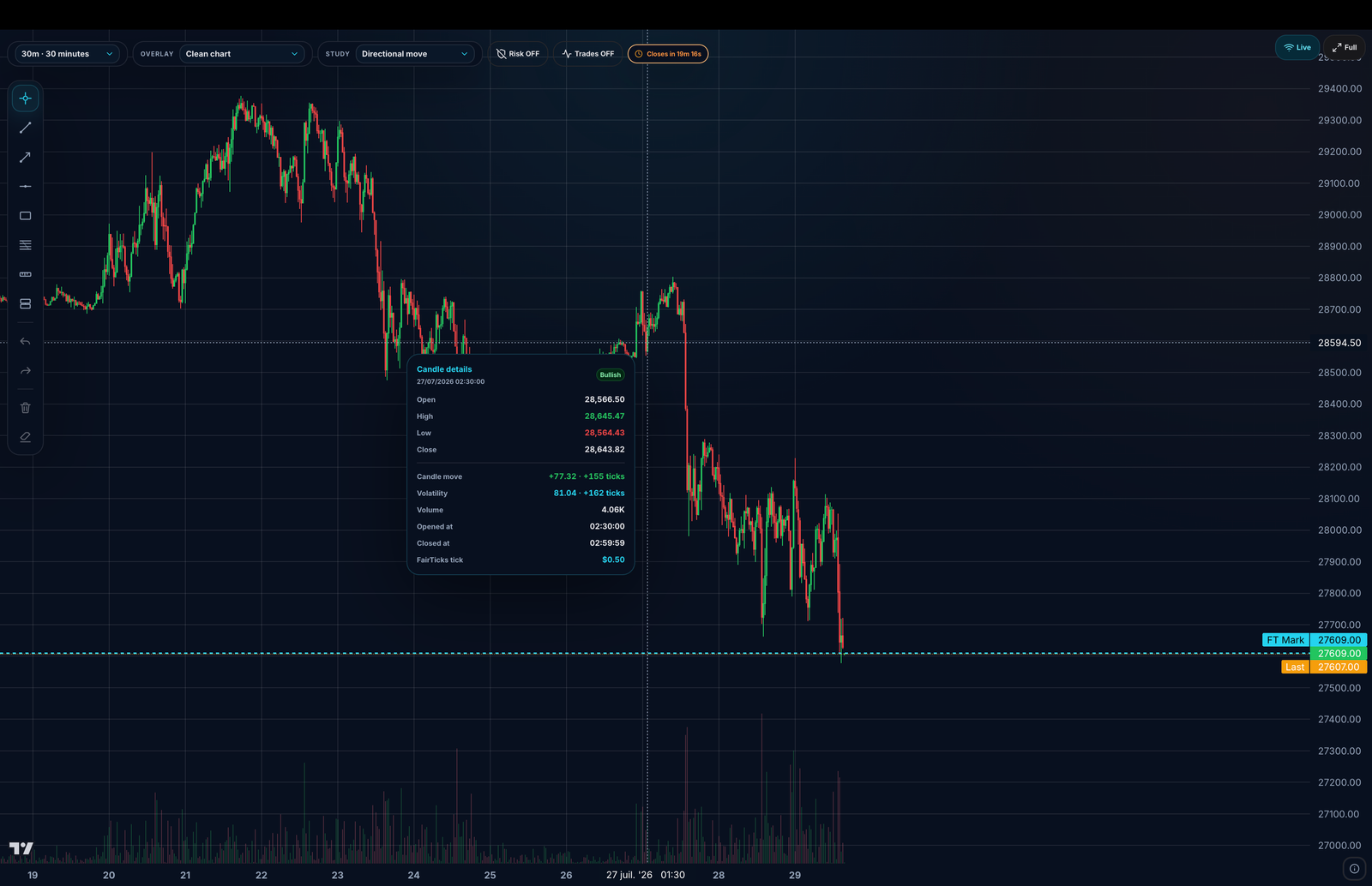
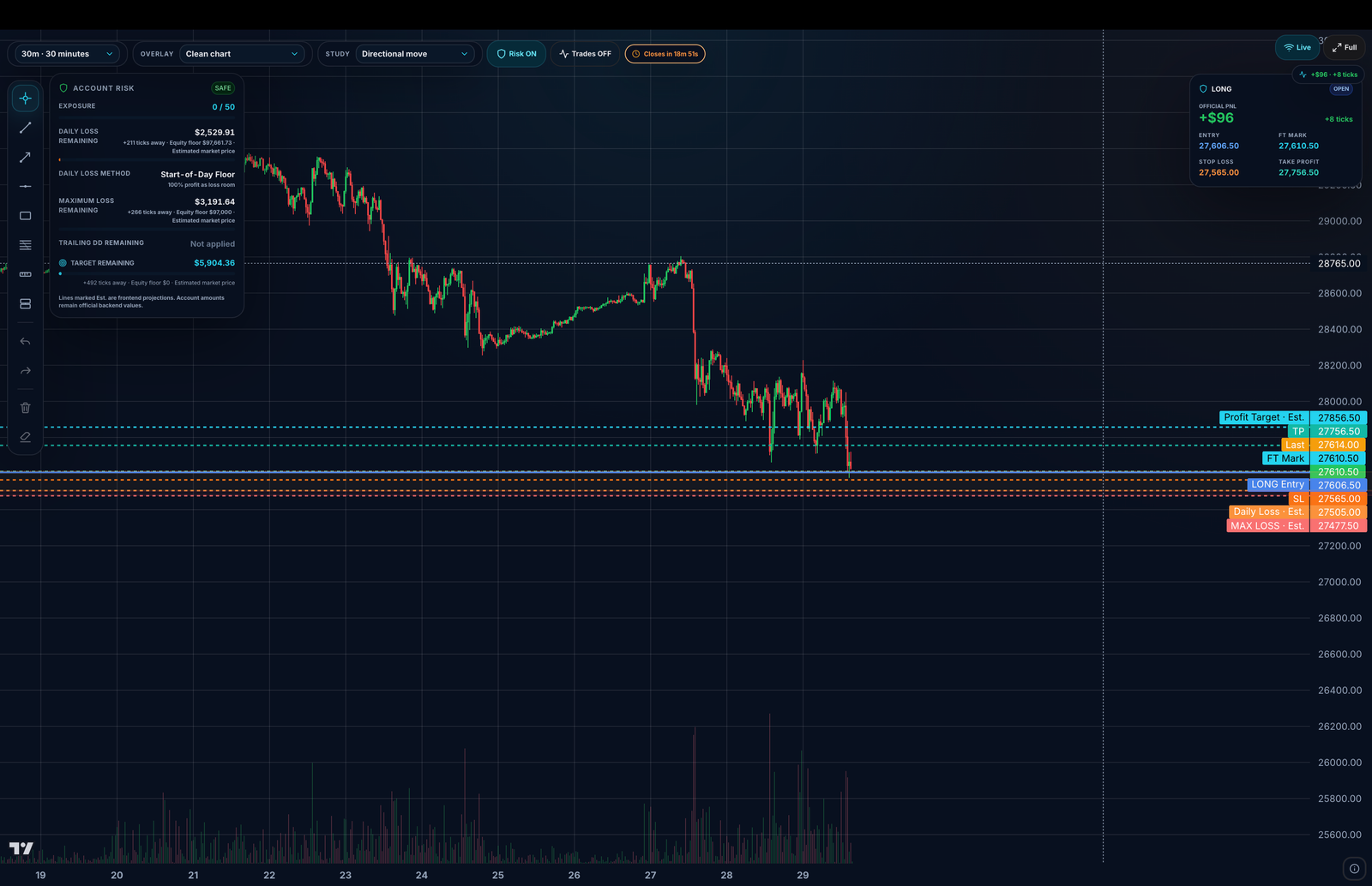
The screenshots below show the chart in three real trading states: a clean market view, a chart with the Account Risk panel visible, and a chart with an active position plus projected rule levels.
1. What the chart is — and what it is not
The FairTicks chart is your market window. It helps you read price movement, understand candle structure, follow your open position, see entries and exits, and stay aware of how close the account is to a risk breach.
It is not a place to hide behind dozens of indicators. At FairTicks, performance comes from discipline, exposure control, rule awareness, and account survival. The chart keeps that visible.
- See price movement in real time.
- Understand each candle: open, high, low, close, range, and volume.
- Track official mark price and visual last price separately.
- See open position entry, stop, take-profit, and trade markers.
- See risk distance before a rule becomes a breach.
flowchart LR
A[You watch the chart] --> B[You understand price structure]
B --> C[You see risk distance live]
C --> D[You control exposure]
D --> E[Account survives]
E --> F[Qualification path or payout readiness]
style C fill:#3d1f1f,stroke:#ef4444,color:#fff
style E fill:#0f3d2e,stroke:#22c55e,color:#fff
style F fill:#0e2a36,stroke:#22d3ee,color:#fff
On a Training account, chart progress does not mean payout eligibility. Payout readiness applies only on a Qualified or Straight account where payout rules can actually apply.
2. The big picture — chart layout
The chart screen is organized so the most important information stays close to your eyes: the selected market, the chart tools, the candle area, your risk panel, and your trade markers.
flowchart TB
subgraph TOP[Top area]
H1[Market Header: symbol, official mark, visual last, session, 24h data]
end
subgraph BAR[Control area]
H2[Chart Toolbar: timeframe, overlays, studies, Risk ON/OFF, Trades ON/OFF, Live, Full]
end
subgraph MAIN[Chart workspace]
direction LR
L[Drawing Tools]
C[Candles + price lines + trade markers]
R[Account Risk panel]
end
TOP --> BAR --> MAIN
style C fill:#0e2a36,stroke:#22d3ee,color:#fff
style R fill:#3d1f1f,stroke:#ef4444,color:#fff
| Zone | Where | What it is for |
|---|---|---|
| Market Header | Top strip | Shows the selected market, official prices, session state, 24h movement, and volume. |
| Chart Toolbar | Above the candles | Controls timeframe, overlays, studies, risk visibility, trade markers, live mode, and fullscreen. |
| Drawing Tools | Left vertical toolbar | Lets you draw trend lines, Fibonacci, rectangles, horizontal levels, measure moves, and RR boxes. |
| Candle area | Main center area | Displays candles, price lines, risk rule lines, position lines, and markers. |
| Account Risk panel | Left side of the chart when Risk is ON | Shows live exposure, remaining buffers, risk state, cooldown/read-only state, and tick distance. |
Visual walkthrough of the chart workspace
These controls change chart presentation and visibility. They do not alter the official account rules.
Use trend lines, rays, horizontal levels, rectangles, Fibonacci, Measure, and Risk/Reward drawings to plan and review.
The center shows market structure over time. The right axis shows price, and the bottom axis shows time.
Shows exposure, remaining rule buffers, risk method, target remaining, and whether a projected price line is currently available.
Displays official P&L, tick result, Entry, FT Mark, Stop Loss, Take Profit, direction, and current position state.
Labels on the right axis let you compare live price, trade structure, account risk, and target distance without estimating from the grid.
3. How to read a candle
A candle summarizes what happened during one block of time. If the timeframe is 1 minute, each candle shows the price behavior during one minute. If the timeframe is 15 minutes, each candle summarizes 15 minutes.
| Part | Meaning |
|---|---|
| Open | The first price of the candle period. |
| Close | The last price of the candle period. |
| High | The highest price reached during the period. |
| Low | The lowest price reached during the period. |
| Body | The thick part between Open and Close. |
| Wick / Shadow | The thin lines showing the extreme high and low. |
| Candle color | Meaning |
|---|---|
| Green | Close is above Open. Price moved up during the candle. |
| Red | Close is below Open. Price moved down during the candle. |
A long body usually shows strong movement during that period.
Long wicks show that the market tried to move in one direction but was rejected before the candle closed.
4. The Market Header strip
The Market Header is the top strip above the chart. It tells you what market you are viewing and which numbers are official.
| Label | What it means |
|---|---|
| Market dropdown | Click it to search and switch markets. You can filter by asset class and see market availability. |
| Market type | The asset class, such as Crypto, Stock, ETF, Commodity, or Index. |
| Official Mark | The official price used for P&L, risk, exposure, and breach logic. This is the referee. |
| Visual Last | A faster visual price used to make the chart feel responsive. It is not the official P&L source. |
| Logical Tick | The FairTicks tick step for the market. Example: a BTC logical tick may represent a $5 price movement. |
| 24h Change | How much the market moved in the last 24 hours. Green means up, red means down. |
| 24h Volume | How much activity the market had during the last 24 hours. |
| Market Open / Session | Shows whether the market is currently open and can show a countdown to open or close. |
Official Mark vs Visual Last
Think of Visual Last as the lively display price that makes the chart feel alive. Think of Official Mark as the referee. Your money, risk, account state, and breach calculations always follow the Official Mark.
flowchart LR
V[Visual Last<br/>fast visual movement] -->|UI feel only| Chart[Chart movement]
M[Official Mark<br/>the referee] -->|source of truth| PnL[P&L, risk, exposure, breaches]
style M fill:#0e2a36,stroke:#22d3ee,color:#fff
style PnL fill:#3d1f1f,stroke:#ef4444,color:#fff
If a visual price and an official number ever look slightly different, trust the official number. The backend calculation is authoritative.
5. The Chart Toolbar
The Chart Toolbar sits above the candles. It controls how you view the market, what information is overlaid, and whether risk and trade markers are visible.
| Control | What it does |
|---|---|
| Timeframe | Changes how much time each candle represents. |
| Overlay | Adds optional overlays such as EMA or VWAP. Clean chart means no overlay. |
| Study | Adds a lower panel such as volume activity, tick range, or body ticks. |
| Risk ON / OFF | Shows or hides Account Risk panel and risk rule price lines. For discipline, keep it ON. |
| Trades ON / OFF | Shows or hides your trade markers directly on the candles. |
| Closes in | Shows the countdown before the current candle closes. |
| Live / Return to live | Jumps back to the latest candle when you have scrolled into the past. |
| Full | Opens the chart in fullscreen mode. |
The candle countdown is based on FairTicks time logic so it stays aligned even if your computer clock is slightly off.
6. Timeframes explained
A timeframe defines how much time each candle represents. Smaller timeframes show more detail and more noise. Larger timeframes show smoother structure and bigger context.
| Timeframe | One candle represents | Best for |
|---|---|---|
| 1s – 30s | Seconds | Ultra-fast reading and short-term scalping context. |
| 1m – 5m | Minutes | Active intraday trading and most beginner chart reading. |
| 15m – 1h | Mid-range blocks | Structure, direction, and cleaner intraday context. |
| 4h – 1D | Hours or a full day | Big-picture trend and market context. |
flowchart LR
S[1s / 5s / 30s<br/>maximum detail] --> M[1m / 5m<br/>active trading]
M --> H[15m / 1h<br/>structure]
H --> D[4h / 1D<br/>big picture]
style S fill:#1f2937,stroke:#94a3b8,color:#fff
style M fill:#0e2a36,stroke:#22d3ee,color:#fff
style H fill:#3a2f12,stroke:#f59e0b,color:#fff
style D fill:#0f3d2e,stroke:#22c55e,color:#fff
Start with 1m or 5m. Use 15m or 1h to understand direction before entering. Use seconds only if your strategy truly needs ultra-fast reading.
7. Price lines on the chart
Horizontal price lines help you understand the most important prices without guessing from the axis.
| Line | Style | Meaning |
|---|---|---|
| FT Mark | Cyan dashed | The official mark price used by FairTicks rules and P&L. |
| Last | Amber dotted | The fast visual price used for smooth movement. |
| LONG / SHORT Entry | Solid green or red | Your entry price for the open position on the selected account and market. |
| Stop | Red dashed | Your stop-loss price, if set. |
| TP | Green dashed | Your take-profit price, if set. |
| Profit Target · Est. | Cyan dashed | An estimated market price where the current open position could reach the remaining account target, when a reliable projection is available. |
| Daily Loss · Est. | Orange-red dashed | An estimated market price associated with the active Daily Loss floor under the current position. |
| MAX LOSS · Est. | Red dashed | An estimated market price associated with the account's Maximum Loss floor under the current position. |
Entry, Stop, and Take-Profit lines appear only when the selected account has an open position on the market currently displayed.
8. Risk Rule Lines: Daily Loss, Max Loss, Trailing
Risk Rule Lines are one of the chart's most important account-protection features. They show an estimated price area where an enabled risk rule could become dangerous under the current open position.
A risk line is not a target. It is a danger marker. If price reaches that level under the current position and official P&L calculation, the account can be near or at a breach condition.
| Risk line | Meaning |
|---|---|
| Daily Loss | The projected price area where today's Daily Loss floor would be hit. |
| Max Loss | The projected price area where the overall Max Loss floor would be hit. |
| Trailing Drawdown | The projected price area where the trailing floor would be hit, if enabled. |
How to read risk lines
Risk lines are projected from official live P&L and your current open position. They translate account risk into price terms: “if price gets here under the current conditions, this rule becomes dangerous.”
- The closer price is to a red risk line, the closer the account is to danger.
- The Account Risk panel shows the same risk in dollars and ticks.
- A disabled rule never draws a line.
- If a projection would be misleading, FairTicks hides the line and keeps the dollar buffer visible instead.
| State | Visual tone | Meaning |
|---|---|---|
| Safe | Light red family | There is still meaningful room before the active risk floor. |
| Watch | Orange-red | The account is getting closer to the risk floor. |
| Warning | Red | Risk needs attention before adding exposure. |
| Critical | Bold bright red | The account is very close to breach. |
flowchart TD
A{Is the risk rule enabled?} -->|No| H[No line drawn]
A -->|Yes| B{Exactly one open position on this market?}
B -->|No| P[Panel shows dollar buffers but no projected price line]
B -->|Yes| C[Line projected on price plus tick distance]
style H fill:#2a2a2a,stroke:#888,color:#fff
style P fill:#0e2a36,stroke:#22d3ee,color:#fff
style C fill:#3d1f1f,stroke:#ef4444,color:#fff
Loss-limit lines are always danger lines. They stay in the red family even when your position is currently profitable, because they mark where the account becomes unsafe.
A label ending in Est. is a frontend projection for decision support. Official account amounts and breach decisions remain authoritative. Fast price movement, commissions, rule method, or account updates can change the projection.
9. The Account Risk panel
The Account Risk panel is your live account-protection summary. It appears when Risk is ON and gives you a quick view of exposure, remaining buffers, the active loss method, target remaining, and whether exact price projections are currently available.
| Item | Meaning |
|---|---|
| Status badge | SAFE, WATCH, WARNING, CRITICAL, or BREACHED — your current risk state. |
| Exposure | How much exposure you are using versus the account maximum. |
| Daily loss left | Remaining Daily Loss buffer in dollars and, when projection is possible, ticks away. |
| Max loss left | Remaining Max Loss buffer before the account reaches the hard floor. |
| Trailing left | Remaining Trailing Drawdown buffer, if the rule is enabled. |
| Cooldown banner | Shows when new positions are paused and only closing is allowed. |
| Read-only banner | Shows when trading is disabled, such as breached, expired, passed, or locked states. |
flowchart LR
SAFE[SAFE] --> WATCH[WATCH]
WATCH --> WARN[WARNING]
WARN --> CRIT[CRITICAL]
CRIT --> BR[BREACHED]
style SAFE fill:#0f3d2e,stroke:#22c55e,color:#fff
style WATCH fill:#0e2a36,stroke:#22d3ee,color:#fff
style WARN fill:#3a2f12,stroke:#f59e0b,color:#fff
style CRIT fill:#3d1f1f,stroke:#ef4444,color:#fff
style BR fill:#450a0a,stroke:#ef4444,color:#fff
If a rule is disabled
If a rule is disabled on your account, the panel should show it clearly as disabled. FairTicks should not display a fake remaining number for a rule that is not active.
10. The open-position card
When the selected account has an open position on the displayed market, a compact position card can appear on the chart. It is designed to keep the most actionable position information visible without opening another panel.
| Item | Meaning |
|---|---|
| LONG / SHORT | The position direction. |
| OPEN | The current lifecycle state of the position. |
| Official P&L | The current official unrealized position result. |
| Ticks | The current move expressed in FairTicks logical ticks. |
| Entry | The official entry reference for the active position. |
| FT Mark | The official FairTicks reference currently used for position and risk context. |
| Stop Loss | The active loss-protection level, if configured. |
| Take Profit | The active profit-exit level, if configured. |
The chart displays position and protection levels. Use the supported position-management or DOM controls to change Stop Loss or Take Profit. A visual chart line should not be treated as updated until FairTicks confirms the change.
11. Trade markers: B, S, W, L
Trade markers appear directly on the candle where the action happened, when Trades are ON.
| Marker | Looks like | Meaning |
|---|---|---|
| B | Green arrow below candle | Buy entry. You opened a long position here. |
| S | Red arrow above candle | Sell entry. You opened a short position here. |
| W | Green square | A trade closed with profit in this candle. |
| L | Red square | A trade closed with loss in this candle. |
Condensed markers
If many trades happen inside the same candle, the chart groups them so the screen stays clean.
| You see | It means |
|---|---|
| B | One long entry. |
| 4 on an entry marker | Four entries were condensed into this candle. |
| W | One profitable exit. |
| W 5 | Five trades closed in this candle and the net result was positive. |
| L 3 | Three trades closed in this candle and the net result was negative. |
flowchart LR
E[Entry] -->|B or S marker| O[Position open]
O --> C[Position closed]
C -->|profit| W[W marker]
C -->|loss| L[L marker]
style W fill:#0f3d2e,stroke:#22c55e,color:#fff
style L fill:#3d1f1f,stroke:#ef4444,color:#fff
12. The Candle Details tooltip
Hover a candle to see the Candle Details tooltip. It explains what happened inside that candle and can include trade information if trades occurred during the candle.
| Field | Meaning |
|---|---|
| Open / High / Low / Close | The four candle prices. |
| Candle move | The Open to Close change, shown in dollars and ticks. |
| Volatility | The High to Low range, shown in dollars and ticks. |
| Volume | Market activity during the candle. |
| Opened at / Closed at | The candle start and end time. |
| Candle closes in | For the live candle only, the countdown before the candle closes. |
| FairTicks tick | The market's logical tick size. |
| Move from entry | When you have an open position, the move from your entry in ticks. |
| Live P&L | When you have an open position, your current official P&L. |
| Trades opened / closed | If the candle contains trades, how many opened and closed. |
| Candle realized P&L | Total realized P&L from trades closed in that candle. Hidden when no trade closed. |
You made five scalps inside one 15-minute candle.
The tooltip may show: Trades closed: 5 — 3W / 2L — Candle realized P&L: +$42.
If no trade closed during that candle, no realized P&L line appears.
13. Drawing tools
The drawing toolbar lets you mark structure, measure moves, and build a plan before entering. Select a tool, then click and drag on the chart.
| Tool | Use |
|---|---|
| Cursor | Select, move, and resize drawings. |
| Trend line | Connect two points to see market direction or structure. |
| Ray | A trend line that extends to the right. |
| Horizontal line | Mark an important price level. |
| Rectangle | Highlight a zone, range, supply/demand area, or consolidation. |
| Fibonacci | Draw retracement and extension levels. |
| Measure | Measure percent move, dollar move, and ticks between two points. |
| Risk / Reward | Draw entry and stop, then view a target box and basic risk/reward structure. |
Drawing actions
| Action | Meaning |
|---|---|
| Undo / Redo | Step backward or forward through drawing changes. |
| Delete selected | Remove the selected drawing. |
| Clear all | Remove all drawings for the current market and timeframe. |
Fibonacci — how to read it
Fibonacci direction matters. Drag from a high down to a low, or from a low up to a high. Level 0 anchors at your first click and level 1 anchors at your second click, like professional charting platforms.
- Common retracement levels include 0, 0.236, 0.382, 0.5, 0.618, 0.786, and 1.
- Common extension levels include 1.272 and 1.618.
- Levels can show both the percentage and the exact price.
- Drawings are saved per market and timeframe.
Drawings are saved per market and timeframe. If you switch away and come back, your drawings for that market/timeframe can return in the same chart context.
14. Moving around: zoom, pan, scale, live
The chart is designed to feel fast and natural on desktop and mobile.
| Desktop action | How |
|---|---|
| Zoom in / out | Use the mouse scroll wheel. |
| Pan through time | Click and drag left or right. |
| Stretch price scale | Drag the price axis vertically. |
| Show crosshair and tooltip | Hover a candle. |
| Return to latest candle | Click Live or Return to live. |
| Fullscreen | Click Full. |
| Mobile / touch action | How |
|---|---|
| Zoom | Pinch with two fingers. |
| Pan | Drag with one finger. |
| Scale | Use a two-finger vertical drag where supported. |
| Tooltip | Tap or long-press a candle. |
When you scroll into the past, a Return to live button appears. Tap it to snap back to the latest candle. If you are already following live, new candles reveal naturally as they form.
15. The golden rule: what is official
The chart helps you see and understand the market. The backend decides official account state.
flowchart TD
Chart[What you see on the chart<br/>visual price and smooth movement]
Backend[FairTicks backend<br/>official mark, official P&L, official rules]
You[You make a decision]
Account[Real P&L, exposure, breach state, payout readiness]
Chart -. for understanding .-> You
Backend == decides everything ==> Account
style Backend fill:#0e2a36,stroke:#22d3ee,color:#fff
style Account fill:#0f3d2e,stroke:#22c55e,color:#fff
style Chart fill:#1f2937,stroke:#94a3b8,color:#fff
Your real P&L, exposure, risk state, breach state, and payout eligibility are calculated by the FairTicks backend using official data. The chart is a professional visual interface, not the legal or accounting source of truth.
16. Quick reference tables
Colors at a glance
| Color | On candles | On lines / markers |
|---|---|---|
| Green | Price went up. | Long entry, Win, Take-profit, success state. |
| Red | Price went down. | Short entry, Loss, Stop, risk lines, danger state. |
| Cyan | Not usually a candle color. | FT Mark line and information accents. |
| Amber | Not usually a candle color. | Visual Last line, countdown, warning accent. |
Markers cheat sheet
| Symbol | Meaning |
|---|---|
| B | Bought, entered long. |
| S | Sold, entered short. |
| W | Winning exit. |
| L | Losing exit. |
| 4, W 5, L 3 | Multiple trades condensed into one candle marker. |
Buttons cheat sheet
| Button | Action |
|---|---|
| Timeframe | Change candle duration. |
| Overlay | Add or remove chart overlays. |
| Study | Add or remove a lower study panel. |
| Risk ON/OFF | Show or hide risk lines and the Account Risk panel. |
| Trades ON/OFF | Show or hide trade markers. |
| Live / Return to live | Jump to the newest candle. |
| Full | Use fullscreen chart mode. |
17. FAQ
Why do I not see Daily Loss, Max Loss, or Trailing lines?
Usually because the rule is disabled, Risk is OFF, there is no compatible open position on the displayed market, or an exact price projection would be unreliable. Even without projected price lines, the Account Risk panel can still show live dollar buffers.
My exposure did not change after opening a trade. Is that a bug?
Exposure should update live when the order fills. If something looks delayed, refresh the account state and check the dashboard. Official backend values are the source of truth.
Why are risk lines red even when I am in profit?
Because they are danger levels. They show where a risk floor exists, not whether your current position is good or bad. They stay in the red family because they represent potential account damage.
Why are there two prices: Mark and Last?
Last is for fast visual movement. Mark is the official referee. P&L, exposure, and breach rules follow the Official Mark.
I made many trades inside one candle. Why do I see only one marker?
The chart condenses markers to keep the candle readable. Hover the candle to view opened trades, closed trades, W/L split, and candle realized P&L.
Will my drawings disappear if I switch timeframe?
Drawings are saved per market and timeframe. If you return to the same market and timeframe, those drawings can be restored in that chart context.
Do chart indicators decide whether I pass?
No. Indicators are visual decision tools only. Evaluation and Qualified account rules are decided by the backend: official P&L, exposure, trading days, breaches, payout rules, and account status.
Summary
The FairTicks chart is built to help you trade with clarity. It shows candles, market state, price lines, trade markers, drawing tools, and risk lines, but the most important job is simple: keep account risk visible before it becomes irreversible.
Read the chart for market structure, but always trade from the official risk numbers: mark price, exposure, remaining buffer, and account state.
The chart helps you see. The backend decides.
Use the chart to understand price and plan trades. Use the official FairTicks numbers to manage account survival: Official Mark, live P&L, exposure, remaining buffers, and breach state.
Confused by a chart label or risk line?
Check whether Risk is ON, whether the rule is enabled, whether you have exactly one open position on that market, and whether you are looking at Official Mark or Visual Last. If the display still looks unclear, contact support with your account number and screenshot.